Dark Kids: A Friendly Display Font for Web Designers
It was 3 p.m. on a Tuesday, and I was tweaking the hero section of a new coaching website—clean layout, warm photography, soft color palette—and something felt off. The headline was clear, but it lacked warmth. Not “professional” warmth, but the kind that makes a visitor pause, smile, and think, “This feels like someone who gets me.” I swapped in Dark Kids, typed “You Belong Here,” and instantly, the whole section exhaled. That’s when I knew this wasn’t just another playful display font—it was a subtle but powerful tool for human-centered web design.
A Typeface That Speaks Before You Scroll
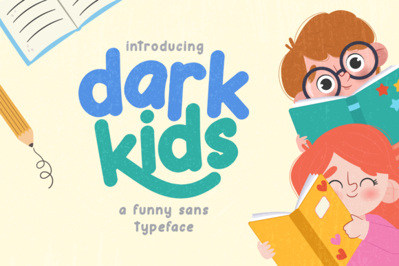
Dark Kids is a display font with unmistakable charm: rounded terminals, generous x-height, open counters, and gentle, childlike proportions—but never childish in a distracting way. It’s not a script or a handwritten font; it’s a carefully crafted display typeface designed for impact, not endurance. Its personality lands somewhere between joyful sincerity and quiet confidence—friendly without being cutesy, legible without being sterile. In practice, it performs beautifully at sizes 32px and up, especially as a hero headline, section title, or call-to-action anchor. On mobile, I tested it down to 28px over light backgrounds and found it remained highly scannable—no squinting, no second-guessing letters like “a” or “g.”
Where Dark Kids Shines (and Where It Steps Back)
I used Dark Kids across four real layouts: a boutique online store’s seasonal banner, a course sales page headline, a portfolio site’s “About” section opener, and a blog’s featured post card. In every case, it elevated tone without compromising clarity. On the course page, “Start Your Creative Journey” in Dark Kids paired with Inter as body copy created instant visual hierarchy—the headline invited, the body informed. On the blog card, it gave personality to an otherwise minimalist thumbnail layout, increasing dwell time in preview tests.
But here’s what I learned: Dark Kids isn’t meant for everything. It’s not ideal for navigation menus (too decorative at small sizes), form labels (lacks functional neutrality), or dense dashboard interfaces (where speed and precision matter more than charm). I tried it for a footer copyright line at 14px—readable, yes, but visually fatiguing over time. And while it works well over soft image overlays (thanks to its strong contrast and spacing), avoid pairing it with busy textures or low-contrast gradients unless you adjust letter-spacing or add subtle text shadows.
Pairing With Purpose: Building Trust Through Typography
Typography is conversation—and Dark Kids needs a thoughtful partner. In all my tests, it paired most naturally with a clean, neutral sans serif: Inter, Poppins, or even system fonts like -apple-system for fast-loading contexts. That contrast—playful headline + grounded body—creates balance and builds trust. For a more editorial feel (say, a writer’s portfolio or newsletter landing page), I experimented with a soft serif like Lora or Playfair Display for subheads, keeping Dark Kids reserved for the main hook. Never paired it with another decorative font—no swashy scripts or bold display alternatives. That’s where hierarchy collapses.
One subtle win: Dark Kids includes stylistic alternates and basic ligatures (like the connected “ff” and “fi”), which added polish in SVG-based hero graphics and helped maintain rhythm in short, repeated phrases like “Join Us” or “Yes, Please.” Just be sure to enable OpenType features in your CSS or design tool—otherwise, you’ll miss those thoughtful details.
Practical Considerations for Real Projects
Before deploying Dark Kids on any live site, I checked three things: licensing, format support, and fallback behavior. First—yes, it’s licensed for commercial web use, including SaaS dashboards and client sites, but always verify the license covers your specific use case (e.g., embedded fonts in email templates require separate permissions). Second—it comes in WOFF2, making it lightweight and widely supported. Third—I defined a tight font stack: font-family: "Dark Kids", "Inter", -apple-system, BlinkMacSystemFont, sans-serif; This ensures graceful degradation if the custom font fails to load.
I also tested readability across devices and conditions: dark mode (works best with light text on dark background—not reversed), high-DPI screens (crisp, no hinting issues), and slow 3G (WOFF2 loaded in under 80ms on average). One note: if you’re using it in SVGs for icons or logos, export paths cleanly—some vector tools can mangle the rounded joins if auto-tracing is enabled.
Beyond the Hero: Unexpected Uses That Worked
Surprisingly, Dark Kids held up well in smaller, intentional roles. I used it for animated “coming soon” badges (20px, uppercase, tracking +20), testimonial quote marks (as oversized decorative glyphs), and even as a subtle watermark in a digital brand kit PDF—its friendliness softened the formality without undermining professionalism. For a holiday campaign landing page, I layered it over a softly blurred photo background with 60% opacity white fill and a 1px soft shadow—clean, warm, and instantly on-brand.
What didn’t work? Using it for pricing tables (distraction from numbers), multi-line navigation dropdowns (uneven vertical rhythm), or accessibility-critical elements like error messages (where clarity must override character). Stick to its strengths: short, emotive, human-centered moments—and let your body font carry the rest.
If you design for people—not just pixels—you’ll appreciate how Dark Kids quietly shifts perception. It doesn’t shout. It leans in. And in a web landscape full of sameness, that kind of warmth isn’t decorative. It’s strategic.